Tuesday, 15 March 2011
Chalk portrait - Clive
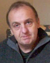
With the remaining portrait session with Clive I did a chalk and charcoal portrait drawing. I used Anthracite Pastelmat paper, which I now highly recommend for chalk drawings as it holds the chalk well and allows textured effects - almost like very fine sandpaper.


Sunday, 13 March 2011
Oil Portrait - Clive
Just finished an oil painting portrait of Clive, a Stamford baker and actor. This was painted from two life sessions of 3 hours each, plus additional work from photographs. The semi-transparent shirt (showing Clive's tattoos) was achieved using Flake white, which is a Lead-based white that is more transparent than Titanium white. Click for a larger image.
 The Big Man, Oil on canvas, (c) Mike Todd 2011
 The Big Man, Oil on canvas, (c) Mike Todd 2011
Friday, 11 March 2011
Pastel portrait
The striking Venezualean model Eiry returned this week to pose for the Stamford Arts Centre life drawing group. This portrait drawing was done using pastel chalks on Pastelmat paper. Click image to zoom.


Friday, 25 February 2011
Ballet dancer drawings
My favourite model posed for us this week at the Stamford Arts Centre. Maggie is a ballet dancer and teacher, and dressed appropriately in a blue tutu. Only colour would do this justice so I drew three pastel drawings. Two on coloured pastelmat paper and one on white ingres paper. I did some finishing at home, but tried (particularly with the first one) not to lose too much of the spontaneity. The first drawing reminds me of Watteau, which can only be a good thing. I may get theses professionally scanned and proofed to offer as limited edition prints. Watch this space and contact me if you want to pre-order. As usual click image for a larger version.
 (c) Mike Todd 2011
 (c) Mike Todd 2011
 (c) Mike Todd 2011
 (c) Mike Todd 2011
Friday, 18 February 2011
Digital prints
Before closing my image editor (Pixelmator) I tried applying different filters and effects to the photo of the watercolour painting in my last blogpost. It is quite easy to come up with interesting effects that could be reproduced as prints (see below). It is almost too easy, but I guess the original work went into the drawing and painting, and there is some skill in judging when a digital image looks 'good'. Maybe you don't think this looks 'good' (I like artists like Georges Rouault). For myself I would be happier using this as a starting point for another painting rather than using the digital print, but perhaps this is an outmoded way of thinking?


Watercolour life portrait
In a break with tradition I tried adding watercolour to a pencil drawing during a pose at the Stamford Arts Centre. As you can see I haven't mastered the subtlety of watercolour yet! I went back over outlines using pen with Umbra ink.


Wednesday, 16 February 2011
Matthews Collins on art
Matthews Collins on wannabe Contemporary Artists: "Pretending to be sophisticated theorists, but never saying anything that has any rational meaning to the ears of any ordinary person".
Subscribe to:
Posts (Atom)