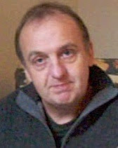
I submitted this with other work to the Welland Valley Art Society to support my application for Exhibiting Membership. I have been accepted!
Showing posts with label oil painting. Show all posts
Showing posts with label oil painting. Show all posts
Saturday, 14 January 2012
New portrait painting - Finished
OK it's been a long time since Day 6! I've had a few more sessions on the portrait, but now it's finished. The main work has been on the background, the hair, mouth and eyes. I think it has the intelligent, semi-smile look that I tried to capture in the original drawing. Click image for larger version. To see step-by-step develoment of this painting, choose the step-by-step label below.
 I submitted this with other work to the Welland Valley Art Society to support my application for Exhibiting Membership. I have been accepted!
I submitted this with other work to the Welland Valley Art Society to support my application for Exhibiting Membership. I have been accepted!

Thursday, 20 October 2011
New portrait painting - Day 6
Further progress in my step-by-step portrait painting. It may not look like I've done much, but have worked on the necklace, chest, ear and hair. I tend to slow up towards the end. Note these are not full days work, I tend to work in fits and starts. I still need some work on the background and may need to 'oil-out' certain areas that have dried out to make sure they are dark enough. I may try lightening the eyes.


Thursday, 13 October 2011
New portrait painting - Day 5
Further work on this step-by-step portrait painting. I am working from two photographs which is a bit tricky. This is now getting closer to the look I want. The thing with portraits is that tiny changes can make a lot of difference as our vision is so attuned to faces. A good tip is to look at the painting in a mirror as this shows up drawing errors. I'm not really sure why. I've also tried varying the background a bit to see if this will work. I think it will. More work to go.


Wednesday, 12 October 2011
New portrait painting - Day 4
Did some more work on my latest portrait painting. To see the history of this painting click the step-by-step tag at the bottom of this post. This time I worked from photographs as the model sessions have finished. Main thing was to correct the drawing - in particular the far eye (too large) and the neckline (too low) and reduced the sauturation of the background. There's a little too much space around the head (if it was a photo I would crop it slightly). It may be OK when in a frame, or alternatively the canvas could be removed and put on a smaller support (although I've never done this). Other way is to put a bit more interest in the background - maybe just some variation in colour and tone. Still a bit more to do on this - I want to capture some of 'intelligence' of the look in the original drawing.


Wednesday, 5 October 2011
New portrait painting - Day 3
I did another afternoon's work on this portrait at a sitting. I used a pallette with a yellow string and red string. Yellow being lemon yellow, ochre, raw sienna and raw umber. Red being cadmium red, indian red, burnt sienna and burnt umber. Also added white, black and ultramarine. A necklace had appeared and I decided to include this.
I also took a couple of photographs as this was the final sitting. Next thing will be to compare the phto with the painting and see where my drawing is out and then decide what to do about it. I don't want to transform the painting to become the photo, i.e. I want to retain the 'painted from life' feeling as much as possible, however a few changes may provide benefits.

I also took a couple of photographs as this was the final sitting. Next thing will be to compare the phto with the painting and see where my drawing is out and then decide what to do about it. I don't want to transform the painting to become the photo, i.e. I want to retain the 'painted from life' feeling as much as possible, however a few changes may provide benefits.

Thursday, 22 September 2011
New portrait painting - Day 2
OK I decided to paint the background. I remembered her top was blue and I played with some colour options on the computer and decided on a gold background. Used some white, ochre, green and a transparent red oxide to give a muted yellow/gold colour. I also shaved some hair off the back of the head to emphasize the upwards tilt.


New portrait painting - Day 1
I've started a new portrait painting at Stamford Arts Centre. I turned up late and no easels were available, so I had to sit down on a donkey (an art class donkey not an hee-haw one). As it turned out this was actually a benefit since (1) I could choose my position in front of the easels (2) I was closer to the model and (3) I was looking up at the model which (as photographers know) is best for portraits. This is a lesson in being late.
I had pre-prepared my canvas with brown acrylic paint. I chose to do a head and shoulders view and spent the first 45 mins doing a charcoal drawing. Sometimes portraits seem to work from the start and this one did. The model had a slight head tilt upwards and a slightly amused semi-smile. When drawing heads at an angle the tendency is to 'straighten' them, so maybe I underplayed the tilt, but at least I was aware of this.
After the break I dusted the charcoal down (carefully) to try and minimise mixing charcoal with paint. I premixed tints on my pallete, from memory using raw umber/white, burnt sienna/white, raw ochre/white mixtures as well as putting white, black, red and burnt umber on my pallete. Using flat brushes I found the lights first, looking for yellow, red and neutral tints. Then I moved to the darks and finally the mid-tones. Towards the end I wanted more darks, but my palette had become cluttered with white, so I mixed burnt umber with black and used this. This was a bit of a mistake - normally I would have used burnt umber and ultramarine, but I hadn't put the latter on my pallette. The result is a blackness in areas, which is not usually recommended. Nevertheless I'm sure Lucien Freud used black and it didn't do him any harm. It's not too late to sort things out.

Looking at the painting in the cold light of day it's a good start. I didn't take any photos so I'm going to leave until the next session (I might put in a rough background). I think the cheek could go darker. When painting a dark area it is easy to convince yourself that it is lighter because your eyes adjust to the local area rather than the overall picture. The way to judge is to screw up your eyes and look at the whole thing. This brings out the relative tonal areas rather than details or colour.
I had pre-prepared my canvas with brown acrylic paint. I chose to do a head and shoulders view and spent the first 45 mins doing a charcoal drawing. Sometimes portraits seem to work from the start and this one did. The model had a slight head tilt upwards and a slightly amused semi-smile. When drawing heads at an angle the tendency is to 'straighten' them, so maybe I underplayed the tilt, but at least I was aware of this.
After the break I dusted the charcoal down (carefully) to try and minimise mixing charcoal with paint. I premixed tints on my pallete, from memory using raw umber/white, burnt sienna/white, raw ochre/white mixtures as well as putting white, black, red and burnt umber on my pallete. Using flat brushes I found the lights first, looking for yellow, red and neutral tints. Then I moved to the darks and finally the mid-tones. Towards the end I wanted more darks, but my palette had become cluttered with white, so I mixed burnt umber with black and used this. This was a bit of a mistake - normally I would have used burnt umber and ultramarine, but I hadn't put the latter on my pallette. The result is a blackness in areas, which is not usually recommended. Nevertheless I'm sure Lucien Freud used black and it didn't do him any harm. It's not too late to sort things out.

Looking at the painting in the cold light of day it's a good start. I didn't take any photos so I'm going to leave until the next session (I might put in a rough background). I think the cheek could go darker. When painting a dark area it is easy to convince yourself that it is lighter because your eyes adjust to the local area rather than the overall picture. The way to judge is to screw up your eyes and look at the whole thing. This brings out the relative tonal areas rather than details or colour.
Thursday, 8 September 2011
New painting: After Mondrian
Before I started on the Four Humours series I did this oil painting inspired (of course) by Mondrian's Composition II in Red, Blue, and Yellow. I recreated Mondrian's composition using coloured paper cut-outs, then screwed them up and unwrinkled them to remake the image. I then took a photo of this (lit from one edge) and used this as the basis of the painting.

It's a bit of fun really, playing with two different traditions, but I think the texture and lighting bring something 'warmer' and 'softer' than Mondrian's original. I wasn't much of a Mondrian fan until I saw a number of them displayed together at Tate Modern. My emotional reaction to them was quite unexpected, which was partly due to the lighting in the gallery. You can't beat seeing paintings in the flesh rather than in books or on display screens.

It's a bit of fun really, playing with two different traditions, but I think the texture and lighting bring something 'warmer' and 'softer' than Mondrian's original. I wasn't much of a Mondrian fan until I saw a number of them displayed together at Tate Modern. My emotional reaction to them was quite unexpected, which was partly due to the lighting in the gallery. You can't beat seeing paintings in the flesh rather than in books or on display screens.
Sunday, 31 July 2011
The Four Humours Series
Completed a series of oil paintings based on the 'Four Humours' temperamental categories named by Galen as "sanguine", "melancholic", "choleric" and "phlegmatic" after the bodily humours. These humours are traditionally associated with the colours Red, Black, Yellow and Blue respectively. The general idea is that personalities should be balanced, or at least avoid extremes. My natural inclination is towards the Phlegmatic.
I did a Myers-Briggs Type Indicator test at work which characterised me as INFP (introversion, intuition, feeling, perception) with borderline INTP (introversion, intuition, thinking, perception). INFPs have been refered to as Healers and INTPs as Architects. Amongst my scientific colleagues I was unusual in being 'feeling' slightly more than 'thinking'. There is no one type that is best, but it is interesting to appreciate that different types are largely inherent and that we should take account of these when dealing with others, and perhaps in our life choices.
These square format paintings combine trompe l'oeil with 'colourfield' composition.


I did a Myers-Briggs Type Indicator test at work which characterised me as INFP (introversion, intuition, feeling, perception) with borderline INTP (introversion, intuition, thinking, perception). INFPs have been refered to as Healers and INTPs as Architects. Amongst my scientific colleagues I was unusual in being 'feeling' slightly more than 'thinking'. There is no one type that is best, but it is interesting to appreciate that different types are largely inherent and that we should take account of these when dealing with others, and perhaps in our life choices.
These square format paintings combine trompe l'oeil with 'colourfield' composition.

The Four Humours: Melancholic (Somber – Guardian – Sensing-Judging (SJ)). Oil on canvas. (c) Mike Todd 2011

The Four Humours: Choleric (Enthusiastic – Idealist – Intuitive-Feeling (NF)). Oil on canvas. (c) Mike Todd 2011

The Four Humours: Sanguine (Cheerful – Artisan – Sensing-Perceiving (SP)). Oil on canvas. (c) Mike Todd 2011

The Four Humours: Phlegmatic (Calm – Rationalist – Intuitive-Thinking (NT)). Oil on canvas. (c) Mike Todd 2011.
Wednesday, 27 July 2011
New painting: Lydia and flowers
Just finished a new portrait painting. The model, Lydia, posed with killer lipstick for one afternoon at the Stamford Arts Centre. The work was completed from photographs, with flowers added to fill the space and to reflect Lydia's sunny and colourful personality. The whole aims to suggest femininity and fecundity. Click on image for larger version.
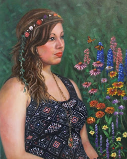 Lydia and flowers, oil on canvas, (c) Mike Todd 2011
 Lydia and flowers, oil on canvas, (c) Mike Todd 2011
Saturday, 9 July 2011
New painting - Blues guitarist
Completed a portrait in oil of a guitar player. This was completed over two sessions at the Stamford Arts Centre together with working from photographs. Blue was chosen as a background to complement the guitar and provide a 'blues' feel. The darkness and 'streelight' outside are fictions to give an atmosphere and provide colour echo and contrast, altough a real window was there. The guitarist, Andy, runs the Arts Centre Bar and performs in a band.
 Blues guitar player, oil on canvas, (c) Mike Todd 2011
 Blues guitar player, oil on canvas, (c) Mike Todd 2011
Thursday, 7 July 2011
New painting - Three Pears
Completed a new oil painting of three pears. This is painted on canvas board. I've taken some framed still life paintings to the Backstairs Gallery within Swans of Oakham. Feel free to visit and buy!


Tuesday, 24 May 2011
Commission - Jokulsarlon glacier lake
I've recently completed an oil painting commission for two friends. This is a composition based on images of Jokulsarlon glacier lake in Iceland. The couple visited there and wanted an original painting inspired by the place. I used elements from their photographs with other references to create an imagined landscape. Adding a sunset element helps balance the blues of the painting and creates drama in the stillness of the landscape.
 Jokulsarlon landscape, oil on canvas board, (c) Mike Todd 2011
 Jokulsarlon landscape, oil on canvas board, (c) Mike Todd 2011
Please contact me if you are interested in commissioning work.
Saturday, 14 May 2011
New painting - garlic bulbs
Yet another new painting completed. I feel a bit self-conscious at the supermarket when going through the vegetable section looking for interesting subjects to paint. Each bulb is an individual! The beauty of these still lifes is that once they have been painted I can eat the subject. I'm now looking at recipes for garlic lamb. Click image for larger version.
 Four garlic bulbs, Oil on Dibond, 150mm x 300m, (c) Mike Todd 2011
 Four garlic bulbs, Oil on Dibond, 150mm x 300m, (c) Mike Todd 2011
Thursday, 12 May 2011
New painting - boxes
Just completed a new oil painting of cardboard boxes. I used a seductive cerulean blue (provided by the very expensive Schmincke Mussini Manganese Cerulean Blue) as a complementary to the orange boxes. Click image for larger version.
 Cardboard boxes, Oil on canvas, (c) Mike Todd 2011
 Cardboard boxes, Oil on canvas, (c) Mike Todd 2011
Monday, 2 May 2011
New painting - onion string
Just completed a new still life oil painting of a string of onions. This is on Dibond, an aluminium composite panel. I paint on the coated side which has a modified polyester lacquer which is smooth and hard. To prepare the panel I rub down the surface with an abrasive pad and then coat with Acrylic gesso primer. Panel size is 300mm x 150mm.
 String of onions, Oil on Dibond, (c) Mike Todd 2011
 String of onions, Oil on Dibond, (c) Mike Todd 2011
Monday, 4 April 2011
New painting - Mandarin Oranges
Just completed a new painting, a still life with mandarin oranges. This is an oil painting on 150mm x 300mm board. Needs a month plus to dry before varnishing and framing.
 Still life with mandarin oranges, Oil on board, (c) Mike Todd 2011.
 Still life with mandarin oranges, Oil on board, (c) Mike Todd 2011.
Sunday, 13 March 2011
Oil Portrait - Clive
Just finished an oil painting portrait of Clive, a Stamford baker and actor. This was painted from two life sessions of 3 hours each, plus additional work from photographs. The semi-transparent shirt (showing Clive's tattoos) was achieved using Flake white, which is a Lead-based white that is more transparent than Titanium white. Click for a larger image.
 The Big Man, Oil on canvas, (c) Mike Todd 2011
 The Big Man, Oil on canvas, (c) Mike Todd 2011
Sunday, 13 February 2011
New painting - Eiry Reading
This new oil painting is based on a recent life-drawing (see 28th Jan blog entry). Originally conceived as a naturalistic painting, this gradually morphed into a stylised composition, where outlines are painted in black, reflecting the linear drawing. I love the green against the burnt sienna background. Click to zoom.
 Eiry Reading, Oil on Canvas, (c) Mike Todd 2011
 Eiry Reading, Oil on Canvas, (c) Mike Todd 2011
Tuesday, 4 January 2011
Step-by-step oil painting: Cottesmore Hunt
I'll take you through the stages in a recent oil painting. Unlike the lemons still life example, this painting was worked up from an accurate underdrawing. The painting was based on a photograph of a local hunt taken by the professional photographer Nico Morgan. See Figure 1.
 Figure 1. Original photographic image. (c) Nico Morgan
I found this online, however just because it is online does not make it copyright free. In this case there would be no doubt that the painting would be substantially derived from the photograph, and thus the copyright holder for the photograph hold rights to the image. As I also intended to make the painting available for sale I wanted to be clear that there would be no on-going copyright issues. I therefore contacted Nico and asked if he could quote for a license for a one-off original painting - payable prior to release for sale. Nico was very pleased to be asked, as this is not always the case, and quoted a very reasonable one-off payment. I then downloaded a copy of the photograph for reference (using Nico's paid digital download site).
To transfer to canvas I first drew a version in pencil on paper at the size to fit the canvas I was to use (400mm x 600mm). This was guided by a squared-up print of the photograph. Here I decided which things to include or remove - e.g. removing the riders in the background, some of the hounds, and I also moved the hound at the extreme left of the image. Figure 2.
 Figure 2. Outline drawing in pencil on paper
The canvas was pre-prepared stretched linen, which I coloured with grey acrylic paint. To transfer the drawing I used tracing paper to trace the drawing on paper, then coated the back with compressed charcoal and retraced over the outlines on to the canvas. The charocal outlines can be seen in Figure 3. I then started to lay in the individual hounds, with relatively simple blocks of colour and tone. Mostly I used the image on my laptop as a reference.
 Figure 3. Charcoal outlines on canvas and initial lay-in of hounds.
 Figure 4. Foreground subjects laid in
 Figure 5. Lay in of road and background
 Figure 6. Detail added to background.
 Figure 7. Final Painting: Cottesmore Hunt (Castle Bytham, January 2010).
 Figure 1. Original photographic image. (c) Nico Morgan
To transfer to canvas I first drew a version in pencil on paper at the size to fit the canvas I was to use (400mm x 600mm). This was guided by a squared-up print of the photograph. Here I decided which things to include or remove - e.g. removing the riders in the background, some of the hounds, and I also moved the hound at the extreme left of the image. Figure 2.
 Figure 2. Outline drawing in pencil on paper
The canvas was pre-prepared stretched linen, which I coloured with grey acrylic paint. To transfer the drawing I used tracing paper to trace the drawing on paper, then coated the back with compressed charcoal and retraced over the outlines on to the canvas. The charocal outlines can be seen in Figure 3. I then started to lay in the individual hounds, with relatively simple blocks of colour and tone. Mostly I used the image on my laptop as a reference.
 Figure 3. Charcoal outlines on canvas and initial lay-in of hounds.
 This lay-in was continued for the hounds, horse and rider. As the initial layers dried more detail could be worked in to the images. Needless to say this took a long time (weeks).
 Figure 4. Foreground subjects laid in
 The next step was to lay in the road and background. This was done without an underdrawing, with large areas of colour first (Figure 5).
 Figure 5. Lay in of road and background
Next I worked up details in the background. As I could not hope to achieve the detail in the photograph, I had to come up with a way of summarising the bushes, leaves, branches etc. This proved problematic and I tried a number of ways of achieving an 'interesting' and yet not dominant background. In the end I decided to paint a lattice of branches at the top of the picture and apply coloured blobs to simulate leaves (Figure 6).
 Figure 6. Detail added to background.
At this point I reviewed the overall picture and adjusted contrasts etc. I also added a light gold wash over the road and some of the dogs as the picture had become too cool. Final steps were to work on the face of the huntsman. Figure 7 shows the final painting.
 Figure 7. Final Painting: Cottesmore Hunt (Castle Bytham, January 2010).
The painting is framed and for sale in the Backstairs Gallery, Swans of Oakham.
Subscribe to:
Posts (Atom)