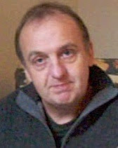
I submitted this with other work to the Welland Valley Art Society to support my application for Exhibiting Membership. I have been accepted!
Showing posts with label portrait. Show all posts
Showing posts with label portrait. Show all posts
Saturday, 14 January 2012
New portrait painting - Finished
OK it's been a long time since Day 6! I've had a few more sessions on the portrait, but now it's finished. The main work has been on the background, the hair, mouth and eyes. I think it has the intelligent, semi-smile look that I tried to capture in the original drawing. Click image for larger version. To see step-by-step develoment of this painting, choose the step-by-step label below.
 I submitted this with other work to the Welland Valley Art Society to support my application for Exhibiting Membership. I have been accepted!
I submitted this with other work to the Welland Valley Art Society to support my application for Exhibiting Membership. I have been accepted!

Sunday, 8 January 2012
Sanguine portrait
Drew a life portrait in sanguine conte chalk, with black and white conte touches at the Stamford Arts Centre Thursday night life drawing group.


Thursday, 20 October 2011
New portrait painting - Day 6
Further progress in my step-by-step portrait painting. It may not look like I've done much, but have worked on the necklace, chest, ear and hair. I tend to slow up towards the end. Note these are not full days work, I tend to work in fits and starts. I still need some work on the background and may need to 'oil-out' certain areas that have dried out to make sure they are dark enough. I may try lightening the eyes.


Thursday, 13 October 2011
New portrait painting - Day 5
Further work on this step-by-step portrait painting. I am working from two photographs which is a bit tricky. This is now getting closer to the look I want. The thing with portraits is that tiny changes can make a lot of difference as our vision is so attuned to faces. A good tip is to look at the painting in a mirror as this shows up drawing errors. I'm not really sure why. I've also tried varying the background a bit to see if this will work. I think it will. More work to go.


Wednesday, 12 October 2011
New portrait painting - Day 4
Did some more work on my latest portrait painting. To see the history of this painting click the step-by-step tag at the bottom of this post. This time I worked from photographs as the model sessions have finished. Main thing was to correct the drawing - in particular the far eye (too large) and the neckline (too low) and reduced the sauturation of the background. There's a little too much space around the head (if it was a photo I would crop it slightly). It may be OK when in a frame, or alternatively the canvas could be removed and put on a smaller support (although I've never done this). Other way is to put a bit more interest in the background - maybe just some variation in colour and tone. Still a bit more to do on this - I want to capture some of 'intelligence' of the look in the original drawing.


Pastel portrait
Drew a portrait in conte pastels on 'charcoal' pastelmat paper at the Stamford Arts Centre. Click on image for larger vesrion. All rights reserved.


Wednesday, 5 October 2011
New portrait painting - Day 3
I did another afternoon's work on this portrait at a sitting. I used a pallette with a yellow string and red string. Yellow being lemon yellow, ochre, raw sienna and raw umber. Red being cadmium red, indian red, burnt sienna and burnt umber. Also added white, black and ultramarine. A necklace had appeared and I decided to include this.
I also took a couple of photographs as this was the final sitting. Next thing will be to compare the phto with the painting and see where my drawing is out and then decide what to do about it. I don't want to transform the painting to become the photo, i.e. I want to retain the 'painted from life' feeling as much as possible, however a few changes may provide benefits.

I also took a couple of photographs as this was the final sitting. Next thing will be to compare the phto with the painting and see where my drawing is out and then decide what to do about it. I don't want to transform the painting to become the photo, i.e. I want to retain the 'painted from life' feeling as much as possible, however a few changes may provide benefits.

Thursday, 22 September 2011
New portrait painting - Day 2
OK I decided to paint the background. I remembered her top was blue and I played with some colour options on the computer and decided on a gold background. Used some white, ochre, green and a transparent red oxide to give a muted yellow/gold colour. I also shaved some hair off the back of the head to emphasize the upwards tilt.


New portrait painting - Day 1
I've started a new portrait painting at Stamford Arts Centre. I turned up late and no easels were available, so I had to sit down on a donkey (an art class donkey not an hee-haw one). As it turned out this was actually a benefit since (1) I could choose my position in front of the easels (2) I was closer to the model and (3) I was looking up at the model which (as photographers know) is best for portraits. This is a lesson in being late.
I had pre-prepared my canvas with brown acrylic paint. I chose to do a head and shoulders view and spent the first 45 mins doing a charcoal drawing. Sometimes portraits seem to work from the start and this one did. The model had a slight head tilt upwards and a slightly amused semi-smile. When drawing heads at an angle the tendency is to 'straighten' them, so maybe I underplayed the tilt, but at least I was aware of this.
After the break I dusted the charcoal down (carefully) to try and minimise mixing charcoal with paint. I premixed tints on my pallete, from memory using raw umber/white, burnt sienna/white, raw ochre/white mixtures as well as putting white, black, red and burnt umber on my pallete. Using flat brushes I found the lights first, looking for yellow, red and neutral tints. Then I moved to the darks and finally the mid-tones. Towards the end I wanted more darks, but my palette had become cluttered with white, so I mixed burnt umber with black and used this. This was a bit of a mistake - normally I would have used burnt umber and ultramarine, but I hadn't put the latter on my pallette. The result is a blackness in areas, which is not usually recommended. Nevertheless I'm sure Lucien Freud used black and it didn't do him any harm. It's not too late to sort things out.

Looking at the painting in the cold light of day it's a good start. I didn't take any photos so I'm going to leave until the next session (I might put in a rough background). I think the cheek could go darker. When painting a dark area it is easy to convince yourself that it is lighter because your eyes adjust to the local area rather than the overall picture. The way to judge is to screw up your eyes and look at the whole thing. This brings out the relative tonal areas rather than details or colour.
I had pre-prepared my canvas with brown acrylic paint. I chose to do a head and shoulders view and spent the first 45 mins doing a charcoal drawing. Sometimes portraits seem to work from the start and this one did. The model had a slight head tilt upwards and a slightly amused semi-smile. When drawing heads at an angle the tendency is to 'straighten' them, so maybe I underplayed the tilt, but at least I was aware of this.
After the break I dusted the charcoal down (carefully) to try and minimise mixing charcoal with paint. I premixed tints on my pallete, from memory using raw umber/white, burnt sienna/white, raw ochre/white mixtures as well as putting white, black, red and burnt umber on my pallete. Using flat brushes I found the lights first, looking for yellow, red and neutral tints. Then I moved to the darks and finally the mid-tones. Towards the end I wanted more darks, but my palette had become cluttered with white, so I mixed burnt umber with black and used this. This was a bit of a mistake - normally I would have used burnt umber and ultramarine, but I hadn't put the latter on my pallette. The result is a blackness in areas, which is not usually recommended. Nevertheless I'm sure Lucien Freud used black and it didn't do him any harm. It's not too late to sort things out.

Looking at the painting in the cold light of day it's a good start. I didn't take any photos so I'm going to leave until the next session (I might put in a rough background). I think the cheek could go darker. When painting a dark area it is easy to convince yourself that it is lighter because your eyes adjust to the local area rather than the overall picture. The way to judge is to screw up your eyes and look at the whole thing. This brings out the relative tonal areas rather than details or colour.
Tuesday, 13 September 2011
Conte portrait
Used my new portrait conte chalks on a portrait on dark brown card. Drawn in the life class. The result is a bit shiny (partly because I also used a carbon pencil) and is difficult to photograph. Anyway here it be. Click to zoom.


Friday, 2 September 2011
Portrait conte drawings
Tried out my new box of 'portrait' Conte sticks at Stamford last night. As I'd hoped these were a bit more subtle. I still can't resist drawing outlines, but we all have our foibles.


Saturday, 13 August 2011
Life drawings
Two more drawings from the Life Class. I like to try different approaches, and respond to the model and pose before deciding what to do. It also depends what mood I'm in. The first is using Conte chalks on 'charcoal' Pastelmat paper. I used chalks on their side to produce larger areas of colour. The chalks I have are quite saturated so I deliberately pushed the saturation. I think I need to get more subtle colours.
 The second is a more conventional charcoal portrait on off-white paper (cream Ingres paper pre-prepared using Sepia ink wash).

 The second is a more conventional charcoal portrait on off-white paper (cream Ingres paper pre-prepared using Sepia ink wash).

Friday, 29 July 2011
Life drawings
Posted a couple of drawings from this week's Life Drawing group at Stamford Arts Centre. All rights reserved.


Wednesday, 27 July 2011
New painting: Lydia and flowers
Just finished a new portrait painting. The model, Lydia, posed with killer lipstick for one afternoon at the Stamford Arts Centre. The work was completed from photographs, with flowers added to fill the space and to reflect Lydia's sunny and colourful personality. The whole aims to suggest femininity and fecundity. Click on image for larger version.
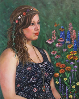 Lydia and flowers, oil on canvas, (c) Mike Todd 2011
 Lydia and flowers, oil on canvas, (c) Mike Todd 2011
Saturday, 9 July 2011
New painting - Blues guitarist
Completed a portrait in oil of a guitar player. This was completed over two sessions at the Stamford Arts Centre together with working from photographs. Blue was chosen as a background to complement the guitar and provide a 'blues' feel. The darkness and 'streelight' outside are fictions to give an atmosphere and provide colour echo and contrast, altough a real window was there. The guitarist, Andy, runs the Arts Centre Bar and performs in a band.
 Blues guitar player, oil on canvas, (c) Mike Todd 2011
 Blues guitar player, oil on canvas, (c) Mike Todd 2011
Friday, 1 July 2011
Portrait Drawing
I enjoyed going back to pencil for this drawing of a pregnant model. I used an 8B pencil then moved to a 4B, with stumping and erasing. Click image for larger version.


Saturday, 23 April 2011
Life drawings
A couple of drawings made at the life class in Stamford Arts Centre this week. One in pencil and one using 'trois crayon' (we were talking about Watteau in the break). This was the same pose from different angles. I really liked the way the head was turned showing the neck muscles. I'm learning that if there is something that captures my interest in a pose or a model then I tend to produce better drawings. As usual click on images for a larger version.


Tuesday, 15 March 2011
Chalk portrait - Clive
With the remaining portrait session with Clive I did a chalk and charcoal portrait drawing. I used Anthracite Pastelmat paper, which I now highly recommend for chalk drawings as it holds the chalk well and allows textured effects - almost like very fine sandpaper.


Sunday, 13 March 2011
Oil Portrait - Clive
Just finished an oil painting portrait of Clive, a Stamford baker and actor. This was painted from two life sessions of 3 hours each, plus additional work from photographs. The semi-transparent shirt (showing Clive's tattoos) was achieved using Flake white, which is a Lead-based white that is more transparent than Titanium white. Click for a larger image.
 The Big Man, Oil on canvas, (c) Mike Todd 2011
 The Big Man, Oil on canvas, (c) Mike Todd 2011
Friday, 11 March 2011
Pastel portrait
The striking Venezualean model Eiry returned this week to pose for the Stamford Arts Centre life drawing group. This portrait drawing was done using pastel chalks on Pastelmat paper. Click image to zoom.


Subscribe to:
Posts (Atom)