Thursday, 22 September 2011
New portrait painting - Day 2
OK I decided to paint the background. I remembered her top was blue and I played with some colour options on the computer and decided on a gold background. Used some white, ochre, green and a transparent red oxide to give a muted yellow/gold colour. I also shaved some hair off the back of the head to emphasize the upwards tilt.

New portrait painting - Day 1
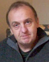
I've started a new portrait painting at Stamford Arts Centre. I turned up late and no easels were available, so I had to sit down on a donkey (an art class donkey not an hee-haw one). As it turned out this was actually a benefit since (1) I could choose my position in front of the easels (2) I was closer to the model and (3) I was looking up at the model which (as photographers know) is best for portraits. This is a lesson in being late.
I had pre-prepared my canvas with brown acrylic paint. I chose to do a head and shoulders view and spent the first 45 mins doing a charcoal drawing. Sometimes portraits seem to work from the start and this one did. The model had a slight head tilt upwards and a slightly amused semi-smile. When drawing heads at an angle the tendency is to 'straighten' them, so maybe I underplayed the tilt, but at least I was aware of this.
After the break I dusted the charcoal down (carefully) to try and minimise mixing charcoal with paint. I premixed tints on my pallete, from memory using raw umber/white, burnt sienna/white, raw ochre/white mixtures as well as putting white, black, red and burnt umber on my pallete. Using flat brushes I found the lights first, looking for yellow, red and neutral tints. Then I moved to the darks and finally the mid-tones. Towards the end I wanted more darks, but my palette had become cluttered with white, so I mixed burnt umber with black and used this. This was a bit of a mistake - normally I would have used burnt umber and ultramarine, but I hadn't put the latter on my pallette. The result is a blackness in areas, which is not usually recommended. Nevertheless I'm sure Lucien Freud used black and it didn't do him any harm. It's not too late to sort things out.

Looking at the painting in the cold light of day it's a good start. I didn't take any photos so I'm going to leave until the next session (I might put in a rough background). I think the cheek could go darker. When painting a dark area it is easy to convince yourself that it is lighter because your eyes adjust to the local area rather than the overall picture. The way to judge is to screw up your eyes and look at the whole thing. This brings out the relative tonal areas rather than details or colour.
Monday, 19 September 2011
D'Ukes of Rutland
I played ukulele with the D'Ukes of Rutland for Rutland Day on the shores of Rutland Water. We are formed from members of the Oakham Ukulele Club, which meets up every Monday at the Railway pub in Oakham. All ages (14 and over), abilities, shapes and sizes welcome.


Tuesday, 13 September 2011
Conte portrait
Used my new portrait conte chalks on a portrait on dark brown card. Drawn in the life class. The result is a bit shiny (partly because I also used a carbon pencil) and is difficult to photograph. Anyway here it be. Click to zoom.


Thursday, 8 September 2011
New painting: After Mondrian
Before I started on the Four Humours series I did this oil painting inspired (of course) by Mondrian's Composition II in Red, Blue, and Yellow. I recreated Mondrian's composition using coloured paper cut-outs, then screwed them up and unwrinkled them to remake the image. I then took a photo of this (lit from one edge) and used this as the basis of the painting.

It's a bit of fun really, playing with two different traditions, but I think the texture and lighting bring something 'warmer' and 'softer' than Mondrian's original. I wasn't much of a Mondrian fan until I saw a number of them displayed together at Tate Modern. My emotional reaction to them was quite unexpected, which was partly due to the lighting in the gallery. You can't beat seeing paintings in the flesh rather than in books or on display screens.

It's a bit of fun really, playing with two different traditions, but I think the texture and lighting bring something 'warmer' and 'softer' than Mondrian's original. I wasn't much of a Mondrian fan until I saw a number of them displayed together at Tate Modern. My emotional reaction to them was quite unexpected, which was partly due to the lighting in the gallery. You can't beat seeing paintings in the flesh rather than in books or on display screens.
Nottingham Castle Open 2011
Good news. I've had four paintings accepted for the Nottingham Castle Open 2011. This follows from the one I had accepted last year. This time I submitted four of a series, with the hope that they would choose them all, as they really need to be seen together. It worked!
The work is The Four Humours that I've already blogged about in July.
The exhibition will be on at the Castle from 8 October - 6 November 2011, where the works will be on sale.
The work is The Four Humours that I've already blogged about in July.
The exhibition will be on at the Castle from 8 October - 6 November 2011, where the works will be on sale.
Friday, 2 September 2011
Portrait conte drawings
Tried out my new box of 'portrait' Conte sticks at Stamford last night. As I'd hoped these were a bit more subtle. I still can't resist drawing outlines, but we all have our foibles.


Subscribe to:
Posts (Atom)